
Client:
SkyCity Adelaide
Introduction:
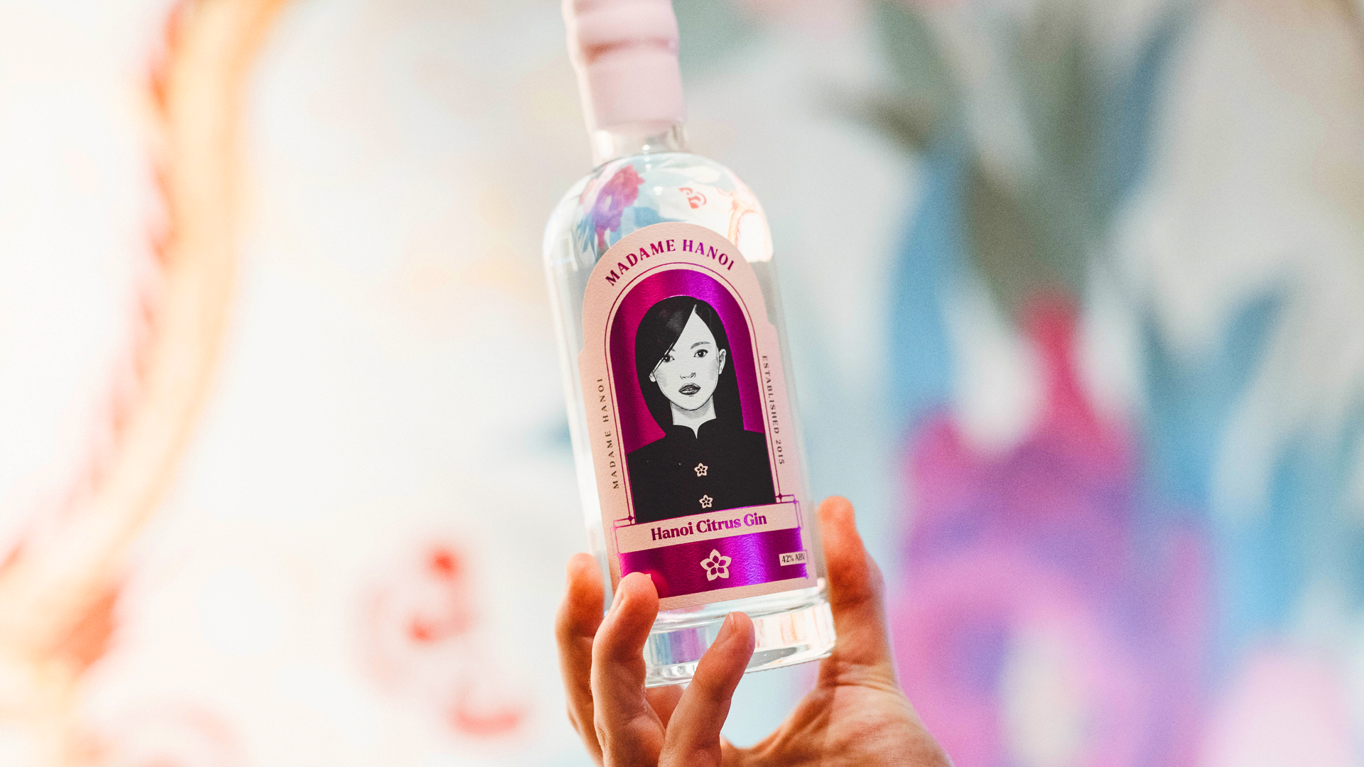
Madame Hanoi has long been one of Adelaide’s finest Vietnamese restaurants, located at SkyCity Adelaide. 7 long years of heathy business and after a $330million expansion to the precinct, it was time for a long awaited refresh due a change in mission and purpose.
It was important for the restaurant to maintain equity in its logo. We didn't want customers who knew the brand to feel the new logo was a new restaurant or something had changed, it needed to pass almost unnoticed, but the visual identity had to be striking, powerful and match the creativity and happiness Madame Hanoi's food gives to people, plus a new found excitement.
The new symbol and logotype represent the combination of French finesse, simplicity and elegance with the gentle, historical elements of Vietnamese culture. It is this relationship between modernism and traditionalism that forms the basis of the proposed visual language for Madame Hanoi.
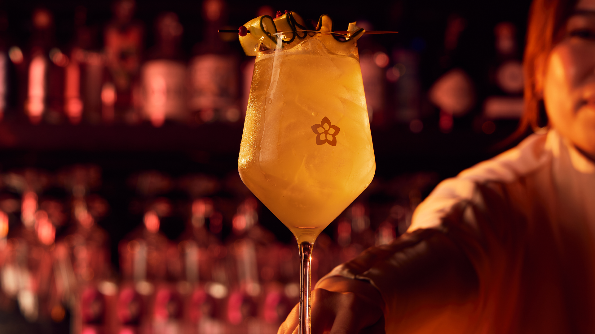
The previous icon had too much visual similarity to the cherry blossom, most commonly knows as the Japanese flower. The idea to reintroduce Madame Hanoi with a lotus flower worked a treat. It’s pointy, star-like qualities also are a homage to the 5 pointed star in the Vietnamese flag.
The new mark is simple, uncomplicated in its form and has gone through a rigorous process of reduction. It is bold and distinctive, it is authoritative, and as a logo should do, it persists in the mind with the powerful burgundy colour used for the flower.
Project:
Brand Strategy
Logo & Brand Identity
Messaging
Print Collateral
Packaging
Campaign Branding